My daughter and I have been reading Betty G. Birney’s Humphrey books. Humphrey is a caring, introspective classroom hamster, and the books follow the school and home lives of a fun group of elementary students. In our most recent book, a guest speaker came to Humphrey’s class and lectured on statistics. Humphrey explained statistics as “harder than any tricky vocabulary words the class had ever practiced.”
The guest speaker clearly didn’t think about his fourth-grade audience (which obviously does not care about statistics), and in the process perpetuated a bad name for people who work with numbers. Numbers people have high expectations put on them. Not only do they have to understand the nuances of their data, but they also have to communicate it with non-numbers people, or people who don’t have time to care about the numbers.
Data matters and can help to tell our story. Before you completely write off numbers and statistics, let’s think about some ways to better use and share numbers.
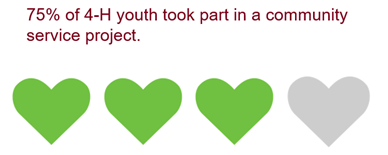
- Whole numbers only. Just like you can’t be 2/3rds of a person, you should not share numbers like 73.4% of participants. Whole numbers are stickier. Sometimes that means rounding up or down to a better whole number like 75%.
- Numbers can be expressed in multiple ways. 75% could also be 3 out of 4. Shade in three icons and leave the fourth a different color and you have an icon array to illustrate your point.
- Save your stats for research journals. No normal person wants to know your p value or your standard deviation. If you know those numbers, high five, but write them up in a research paper. If you must share statistics in a report, put them in an appendix. Numbers people will track them down.
- Convert your numbers to percentages. Percentages are generally easier for our brains to compute. The general population wants to know how many youth in your program reached your goals, not the scores they received on your leadership measure.
- Visualize it. Data visualization is a content area with growing popularity. Adding visuals like clean charts and graphs to share your message will help people to use your data to make decisions.
- Make numbers come to life with stories. Stories stick with people. Use your data points as headers and then connect real-life examples to the data points.
Let’s go and make Humphrey proud by presenting numbers in more understandable ways. What are your lessons learned about sharing data with others?
You are welcome to comment on this blog post. We encourage civil discourse, including spirited disagreement. We will delete comments that contain profanity, pornography or hate speech--any remarks that attack or demean people because of their sex, race, ethnic group, etc.--as well as spam.

Comments
Post a Comment